How The Rectangle Pattern Signals When A Big Move Is Coming…
When prices encounter a resistance level, they often fall. At support levels, prices often find a short-term bottom. Even the most novice traders are familiar with these basic ideas.
The rectangle pattern combines the ideas of support and resistance into a single chart pattern.
In a rectangle pattern, prices move between support and resistance for some time. This is what’s known as a consolidation pattern, and it is often seen after a sharp price move.
How Traders Use The Rectangle Pattern
By itself, the pattern doesn’t offer any clues as to the direction of the next trend. But traders use the rectangle pattern to identify potential trades.
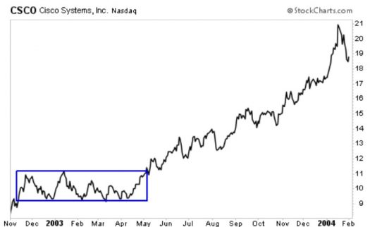
For example, after falling nearly 90% when the Internet bubble burst, Cisco Systems (NSDQ: CSCO) formed a year-long rectangle on the chart below. This allowed traders to see that the worst of the decline was indeed over, and many who spotted rectangles in tech stocks prepared for a new bull market. When CSCO finally broke out of the rectangle, the price almost doubled in just six months. Had the rectangle broken to the downside, it would have been a sign for traders to go short.
After a breakout from a rectangle, prices often briefly move back into the pattern. Most traders will wait for this to happen before taking action.
Rectangles form over weeks or months, and the price moves away from the pattern tend to unfold slowly. This makes it a relatively low-risk trade. All the trader has to do is wait for confirmation that the pattern has been completed. Confirmation can be found with time, meaning, a breakout lasting several weeks is likely to be the start of a new trend. Other indicators, like oscillators, can also be used to confirm the breakout.
Why Rectangles Matter To Traders
Consolidations usually occur before significant market moves. The rectangle pattern is a signal that a move is likely to begin soon. Knowing a market is in consolidation, traders can watch the chart to see when the breakout occurs.
Like several other chart patterns, the rectangle also offers a way to determine a price target. After the breakout, traders expect the price to move by the height of the pattern in the direction of the breakout. If the top of the rectangle forms near $20 a share and the bottom is near $10, the $10 range offers a guide as to the size of the move that should follow the breakout. So, if the stock closes above $20, traders would expect it to eventually reach $30.
Price targets are useful when the trader spots several different trading opportunities. Many traders will take the trades that have the most potential reward and pass on those that have lower projected gains.
Editor’s Note: If you’re looking for ways to generate steady income, consider my colleague Robert Rapier.
Robert wants to give you exclusive access to all his lucrative income picks… forever.
Robert Rapier is offering a legacy membership to ALL THREE of his income investing advisories: Utility Forecaster, Income Forecaster, and Rapier’s Income Accelerator. His new three-in-one service is called the Platinum Income Alliance.
This deal is so lucrative, and stacked so heavily in your favor, Robert can only let 100 people through the doors. Take advantage of this rare opportunity by clicking here today.