Is This Rally Legit? Here’s What This Proven Indicator Says…
I’ve talked about market “breadth” many times over the years.
In fact, one of my favorite breadth indicators alerted me to a potential market correction at the beginning of 2022. Back then, I said it was showing a bearish divergence and was “a clear warning sign that there’s major weakness in the market.”
The market (as measured by the S&P 500) fell over 19% last year.
My point is that market breadth can be a great indicator to see how “healthy” the market is. So it’s worth keeping tabs on…
And recently, breadth has been a hot topic in the financial media. Market pundits have criticized the breadth of this recent upward move in the market. So let’s take a look at what they mean and see whether they’re right…
What Is Market “Breadth” — And Should We Be Worried?
For a quick refresher, breadth refers to the number of stocks going up or down together. If most stocks are going in one direction, then the market is considered to have “breadth” in that direction.
So in this case, the pundits are pointing to the fact that the move is being powered by a few large stocks, rather than the overall majority.
My colleague Nathan Slaughter talked about this phenomenon here. Regardless, here’s the concern…
The S&P 500 has raced out to a spectacular 19% return on the year. But most of that gain can be attributed to a select few stocks. Namely, Alphabet, Apple, Amazon, Microsoft, and Nvidia.
Why? Well, the S&P 500 is calculated on a market capitalization basis. This means that each stock is given a weighting according to its size.
The largest component of the S&P 500 is Apple (AAPL). With a market capitalization of $3 trillion, it makes up almost 8% of the S&P 500. This means if AAPL shares move up 10%, it moves the overall index up almost 0.8%.
Now, that might not seem like much, but it’s massive. Consider this… the smallest component of the S&P 500 is Zions Bancorp (ZION). It sports a market cap of $4 billion. It has a total weighting of just 0.01%. This means you need to see the stock rise 750-fold to move the index as much as a 10% move in Apple.
Another way you can see these larger stocks’ impact on the index is by comparing the regular market-weight S&P 500 to the equal-weighted S&P 500, giving each stock equal weighting regardless of market size.
As I mentioned, the S&P 500 is up 19%, while the equal-weighted index is up just 9%. That is a massive difference.

Some see this as a sign that the market strength is not sustainable. They believe that such a “narrow” breadth means the stock market is vulnerable to a big fall.
To that, I say… the market is always on the verge of a big correction (so it seems).
Granted, my smart-aleck remark has nothing to back it up. Fortunately, research firm Ned Davis does…
What History Tells Us About Narrow Breadth
Ned Davis Research looked back at how many periods in the last 50 years saw similar narrow breadth. It measured this using the number of stocks in the S&P 500 that performed better than the overall index.
Across the 50 years, they found narrow breadth like we see today occur nine times. The stock market was higher three and six months later in six of those nine instances.
Simply put, the historical evidence does not support the idea that it is bad for a relatively small number of stocks to power the stock market higher. In fact, we just saw that happen coming out of the Covid crash…
First, it was consumer staple stocks (think Clorox, Kimberly-Clark, Procter & Gamble) as people stocked up on household goods. Then tech stocks drove the market to new heights as everyone was stuck at home and spent their days online.
The bottom line is that fears that narrow market breadth means an imminent market crash are a bit overblown.
Plus, my favorite market breadth indicator — the Advance/Decline Line, or “AD” Line for short — tells me that there’s plenty of market breadth.
What My Market Breadth Indicator Shows
The AD Line measures how many stocks are rising compared to falling. When a major index (like the S&P 500 or NYSE) hits new highs, and the AD Line doesn’t follow suit, this is known as a bearish divergence.
For example, here’s the chart I shared in January 2022:
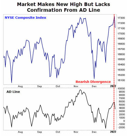
The market (NYSE in this case) hit new highs, but the AD Line failed to confirm that new high. As we now know, the market tumbled, and we entered a bear market.
This wasn’t the only time I used this breadth indicator to warn of a market correction. In August 2021, I also warned of a pullback (and recommended no new trades). A couple of weeks later, the market peaked and then swiftly fell over 5%.
Same story in the fall of 2018. I used this same breadth indicator to warn of a weak market and potential trouble on the horizon. Sure enough, the market peaked at the beginning of October 2018 and dropped roughly 20% over the following two months.
So this indicator — while not perfect — has a strong history of showing when a market is weak or healthy.
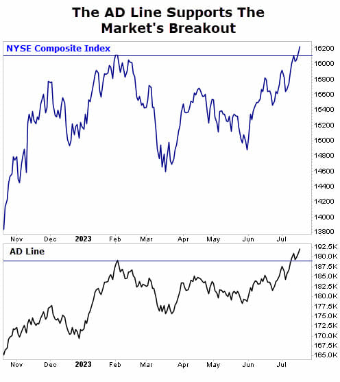
Right now, it’s showing that this latest move higher is healthy. As you can see in the chart below, the market recently topped its February high, and the AD Line is confirming that new high (meaning there’s plenty of market breadth to support it).
Take a look:
The bottom line is that worrying about a market correction is easy, especially coming off one. I recall coming out of the financial crisis, and for years after the market bottomed in March 2009, there were calls for another crash. Instead, we witnessed the best bull market in our lifetimes.
Sure, there were bumps along the way. But from March 2009 to January 2022, the S&P 500 returned more than 600%.
Closing Thoughts
Of course, most people don’t hold trades for that long, but you get the picture. There will always be calls for concern. And we will experience another correction and bear market.
I’m just here to tell you that it won’t be today… at least according to my favorite breadth indicator. It shows that this climb in stocks is healthy. For how long? Who knows. But we will ride the wave until it peters out. Then we’ll hop off, return to cash, and wait for the next wave.
P.S. Did you know many Americans would struggle to cover even a $600 emergency? That’s just “one bad day” away from financial ruin…
It’s a situation we would never care to be in… which is why we’ve put together an exclusive presentation that reveals 12 of the most generous income plays on the market today. Better yet… these stocks pay out 4X more often than “normal” dividend stocks… putting money back in your pocket – FASTER. Get the full story NOW.